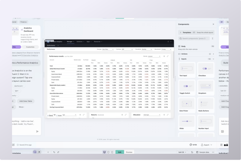
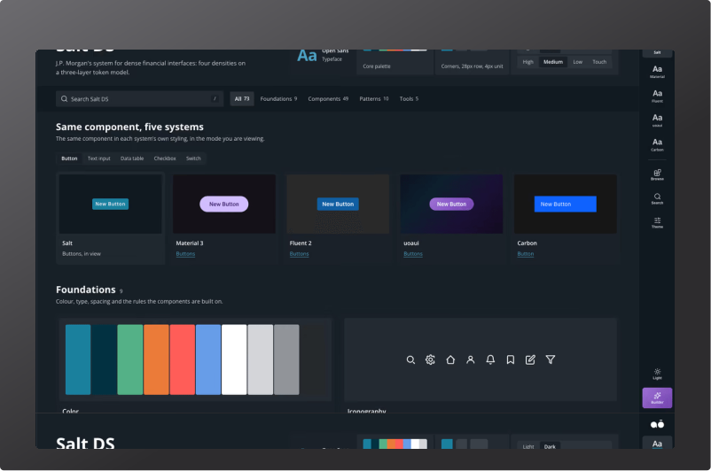
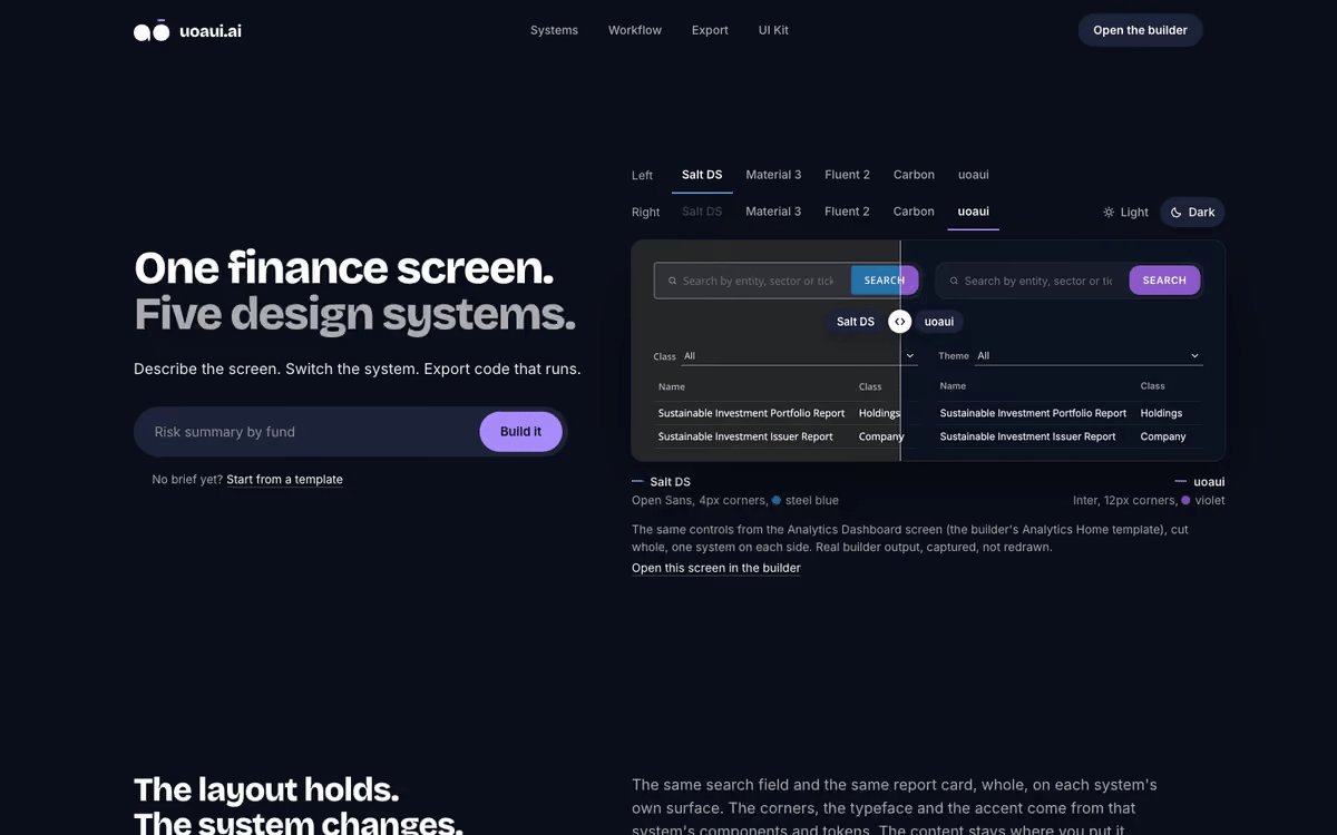
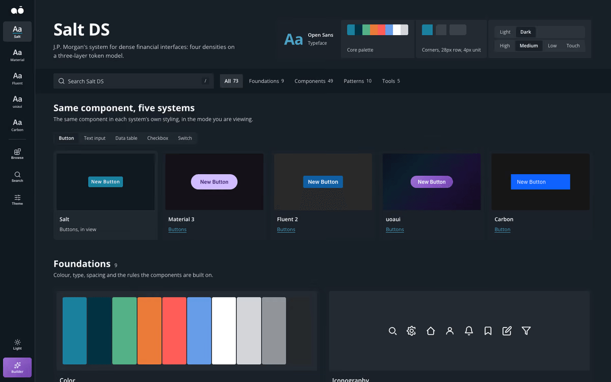
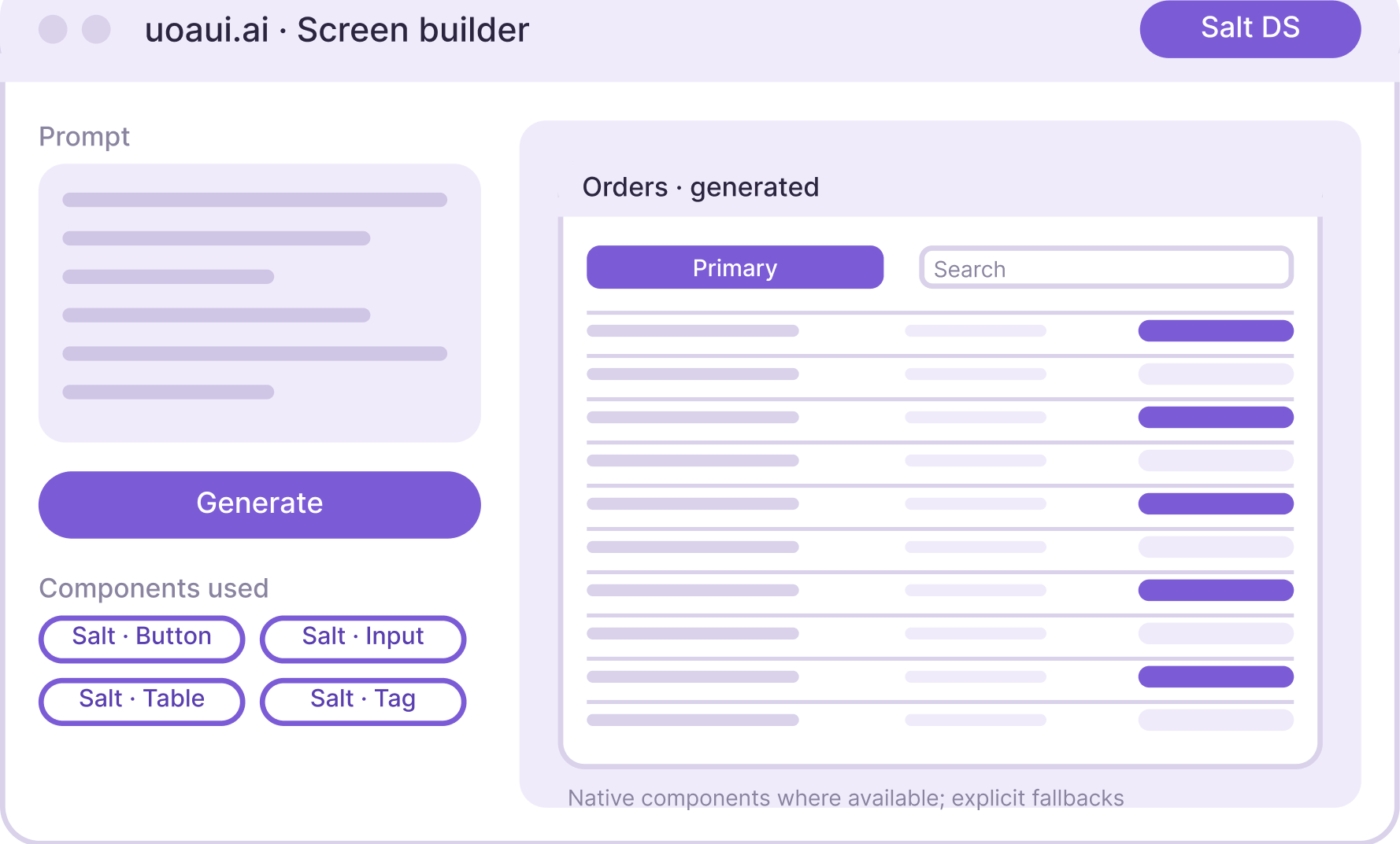
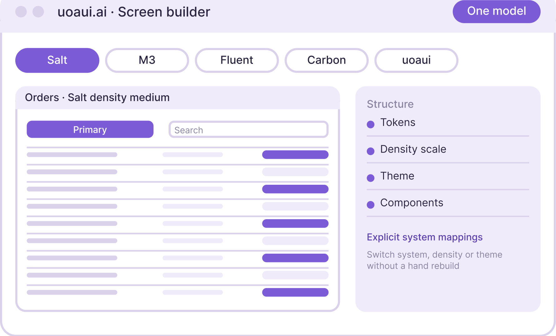
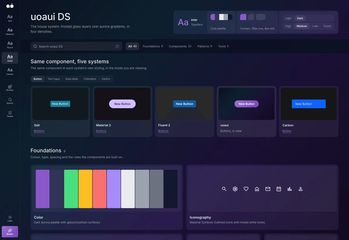
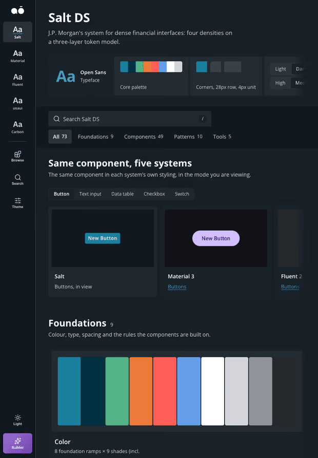
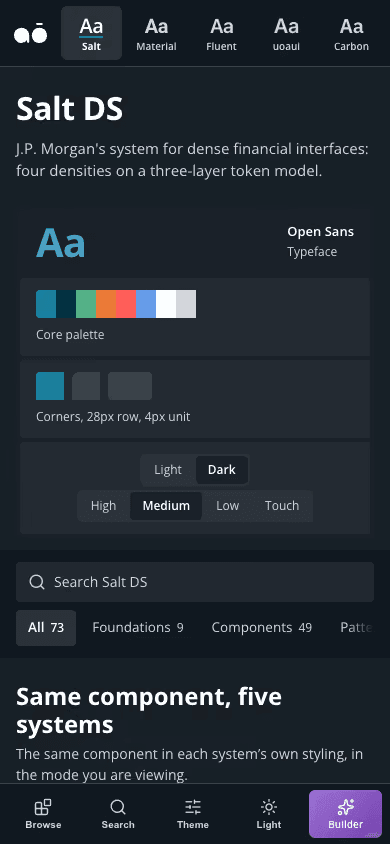
A design platform I'm building on Claude. It turns a prompt into a working screen built from real design systems, Salt, Material, Fluent and Carbon among them, using native components where the mapping supports them, with explicit fallbacks for missing equivalents. Switch system, density or theme and the screen rebuilds.
Where the system acts and where it asks. How a person stays in control without making the AI useless. The compare and tune steps are my answer so far. The model drafts, I decide.
Who it's for, and the trap
Designers like me, which is dangerous, because designing for yourself hides your blind spots. The alpha exists partly to break my own assumptions.
What it isn't
It doesn't ship the final product and I don't claim it does. It closes the gap between a Figma file and the thing a developer can inspect.
User personas
My two design personas: a designer like me and the developer who inspects the output. Role-based working assumptions the private alpha exists to test, not research participants.
Mei Lin
Product Designer
Works inside a design system
“
The model drafts. I decide.
Context
Designs screens inside an established design system, comparing and refining generated drafts.
In this app
A compare step across systems
Tune density, theme and charts
Mapped system components, with explicit fallbacks
Goals
Prompt, generate, compare, tune, export
See the same screen in Salt, Material, Fluent and Carbon
Stay in control without making the AI useless
Pain points
Designing for output you can't predict
Designing for yourself hides your blind spots
Free-form generated UI looked impressive and was unusable
Dev Patel
Front-end Developer
Receives the export
“
Show me code I recognise, not a picture of a screen.
Context
Receives exported React and needs to understand the components, structure and remaining work.
In this app
Export React a developer recognises
Native component mappings and explicit export fallbacks
Token mapping underneath, mapped not generated
Goals
Inspect the exported React
Recognise mapped components and inspect the fallbacks
Close the gap between a Figma file and code
Pain points
Generated screens that use none of the team's components
Screens nobody tested with a user
A Figma file with nothing to inspect
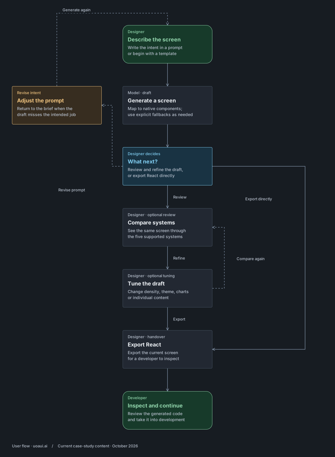
02 The flow
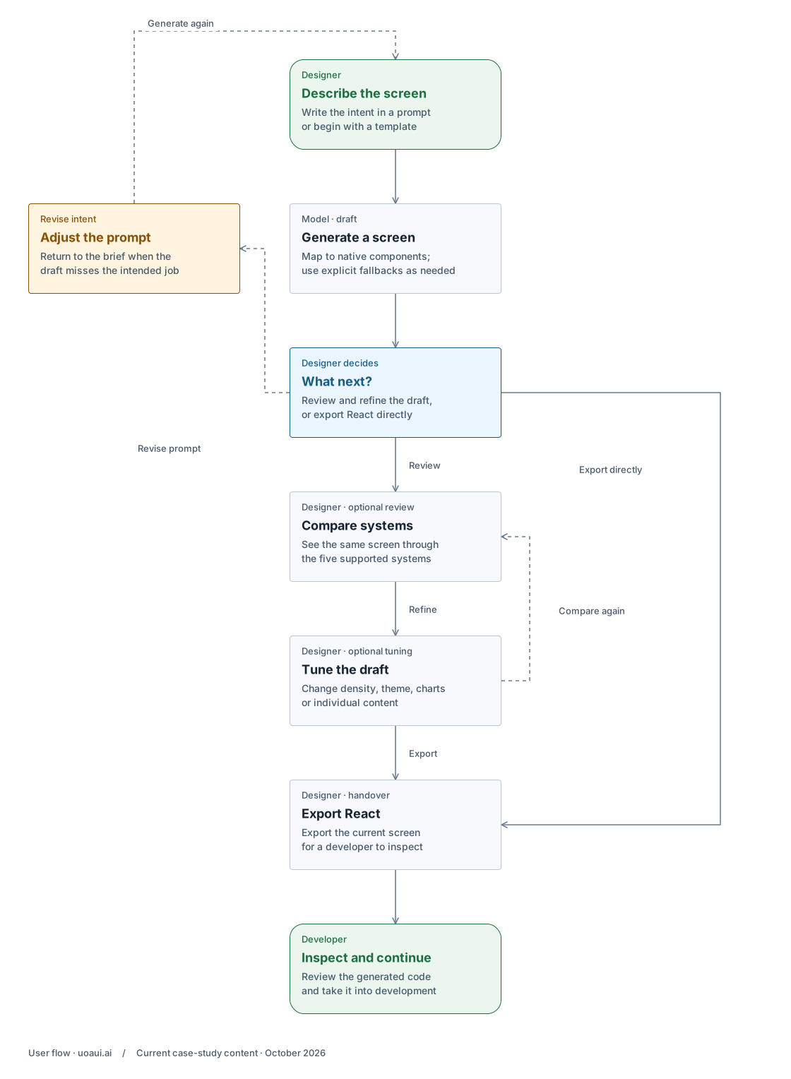
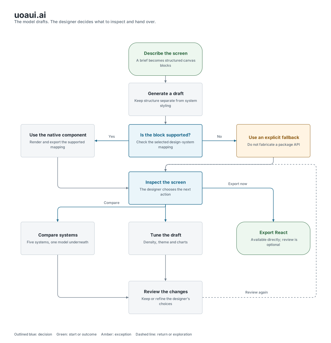
Fromaprompttoascreenadevelopercaninspect.
User flow
The designer can review and refine the draft, or export directly.
Private alpha · compare and tune are optional. Export is a developer handover, not a finished product.
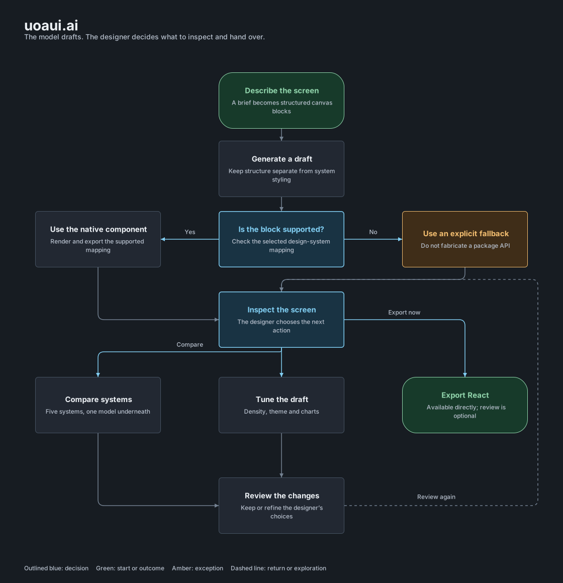
On smaller screens, enlarge the flow to read and explore the branches.
Silent recording. It picks a template, edits one card, then presents the same screen across the five design systems.
User journey
Mei Lin · Product Designer · Works inside a design system · One screen in Salt, a Material version due, one afternoon
Persona
Mei Lin
Product Designer
Works inside a design system
Scenario
Mei has a screen to design in Salt by Friday and a Material version due for a sister team. She describes the screen, reviews the generated canvas, compares the systems, tunes density and theme, and chooses when to export React for a developer to inspect.
Goal
Reach a useful, inspectable screen in a real design system without rebuilding it by hand for every system.
The designer decides. The model drafts.
Native components and explicit fallbacks support the draft. Compare and tune are optional review tools; export is available directly.
01Designer
Prompt
Mei describes the screen in words. The output can't be fully predicted, so the prompt has to say what matters: system, density, data.
Design response
Name the system and density in the prompt
Real-shaped data, not lorem ipsum
What the system does
The prompt is read with the system, density and data named, so the draft starts inside the right constraints.
02Model
Generate
The model adds structured blocks to the canvas. Supported combinations render real system components; other combinations use explicit fallbacks.
Design response
Map supported blocks to native components
The first answer is a draft
What the system does
Claude uses the builder’s block catalogue and canvas tools. Component mappings and fallback renderers turn that structure into the screen.
Draft misses the intent? Return to the prompt.
03Designer
Compare systems
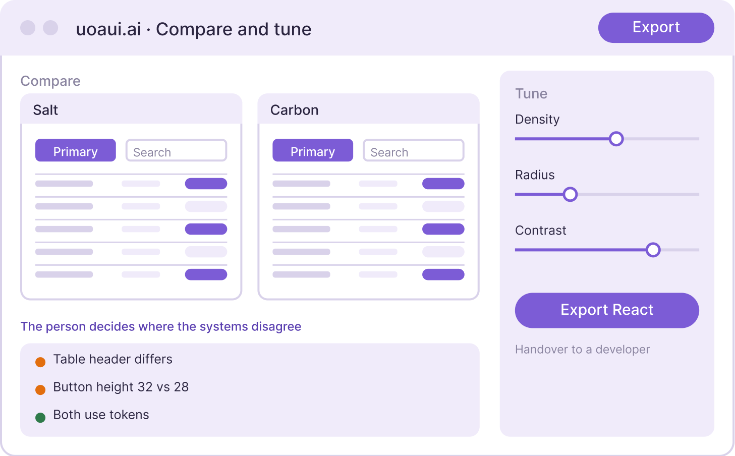
The same screen in Salt, Material, Fluent and Carbon. The hard part is where the systems disagree.
Design response
Side-by-side compare across systems
Inspect where the systems differ
What the system does
The same canvas maps to five systems. Each mapping uses the system’s component and layout APIs where available, with CSS or generic output for unsupported combinations.
04Designer
Tune
Density, theme and charts. This is where the person decides, and where Mei corrects the model most often.
Design response
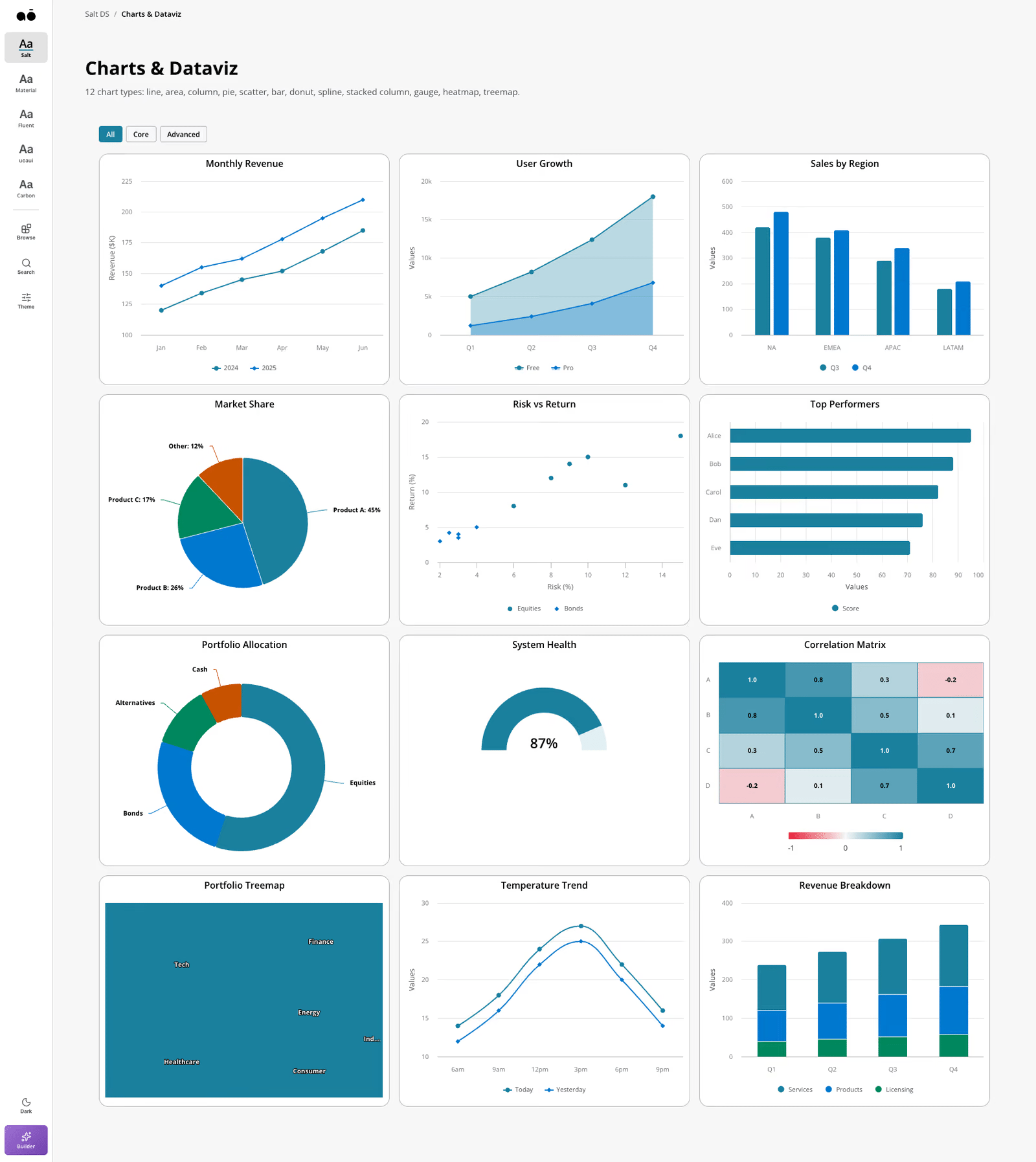
Density, theme and chart controls
Compare and tune before choosing to export
What the system does
Density, theme and chart props re-render the same component tree. Nothing is redrawn by hand.
Changed density or theme? I compare again before handover.
05Designer → developer
Export React
Code a developer recognises. It closes the gap between a Figma file and the thing a developer can inspect.
Design response
Export React
Inspectable component tree and tokens
What the system does
React export includes component mappings and styles, with fallbacks where needed. Export is available directly; the product does not enforce a compare-and-tune gate.
Opportunities
The next validation question: can another designer reach a useful, inspectable screen without me guiding them? The private alpha exists to answer it, and to break my own assumptions.
03 Decisions and trade-offs
Decision map
A private alpha for turning a brief into an inspectable screen. The model edits a structured canvas; mappings connect its blocks to the selected system. Review and export stay in the designer’s hands.
On smaller screens, enlarge the map to read and explore the branches.
Constrain the draft
The model chooses from defined block types and canvas actions. Covered blocks map to real system components; uncovered combinations have explicit fallbacks.
Keep the judgement with the person
System comparison and tuning let the designer inspect the draft. Export remains available directly, so review is a working practice rather than an enforced gate.
Implemented in the private-alpha source
01Mapped components, with explicit fallbacks
What should the model be allowed to make?
A plausible-looking screen is not enough for handover. The output needs to map to components a developer can identify and inspect.
I chose
Mapped system components and fallbacks
Generate structured canvas blocks, then map supported blocks to real system components.
Alternative
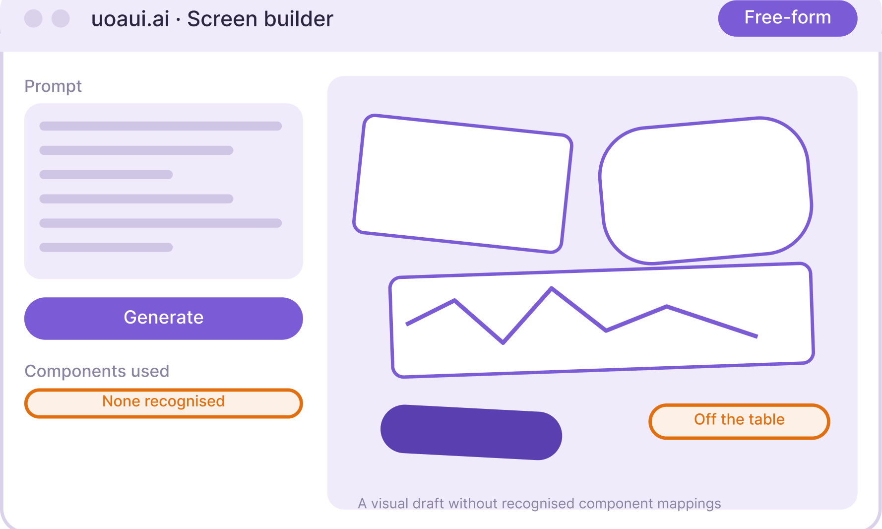
Free-form generated UI
Let the model produce arbitrary UI without the shared block model.
Why I chose it
I constrained generation to the builder’s block model. Where a system has a supported component, the renderer and React export use it. Where it does not, there is a fallback rather than a fabricated package API.
What it cost
The mapping needs maintenance for each system. Unsupported combinations can use custom or generic output, so the designer still needs to inspect them.
What informed the decision
The source sends Claude a catalogue of block types and canvas tools. Its component registry maps supported blocks to Salt, MUI, Fluent and Carbon; the house system uses its own CSS. The renderer and exporter have fallback paths for uncovered combinations.
Working private-alpha comparison
02Switching systems
What should stay stable when the design system changes?
Different systems have their own components, density scales and theme rules. A switch should preserve the intended screen while making those differences visible.
I chose
Five systems, one model underneath
Map a shared screen structure to the supported systems, then inspect the result.
Alternative
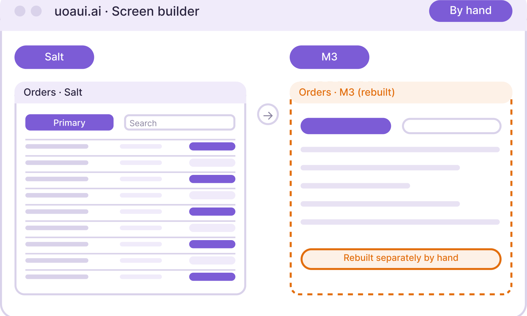
A screen rebuilt by hand
Rebuild the screen separately for every system and maintain the copies.
Why I chose it
I mapped screen structure, tokens, density and theme so I could compare the supported systems without drawing a separate screen for each. The differences still need a person to inspect them.
What it cost
A shared representation has to accommodate different system rules. Some system-specific choices need an explicit decision rather than a direct one-to-one swap.
What informed the decision
The source stores one canvas with a selected system, theme and density. Component and layout registries map that structure differently for each system. The mappings use native APIs where available and token-driven CSS where a system has no equivalent.
Direct export; review is optional
03Review before handover, without locking export
How can a designer inspect the draft before choosing to export?
The first output may miss hierarchy, density or system behaviour. Treating generation as completion would move that correction work into handover.
I chose
Compare and tune as review tools
Use comparison and tuning to review the draft, then choose when to export.
Alternative
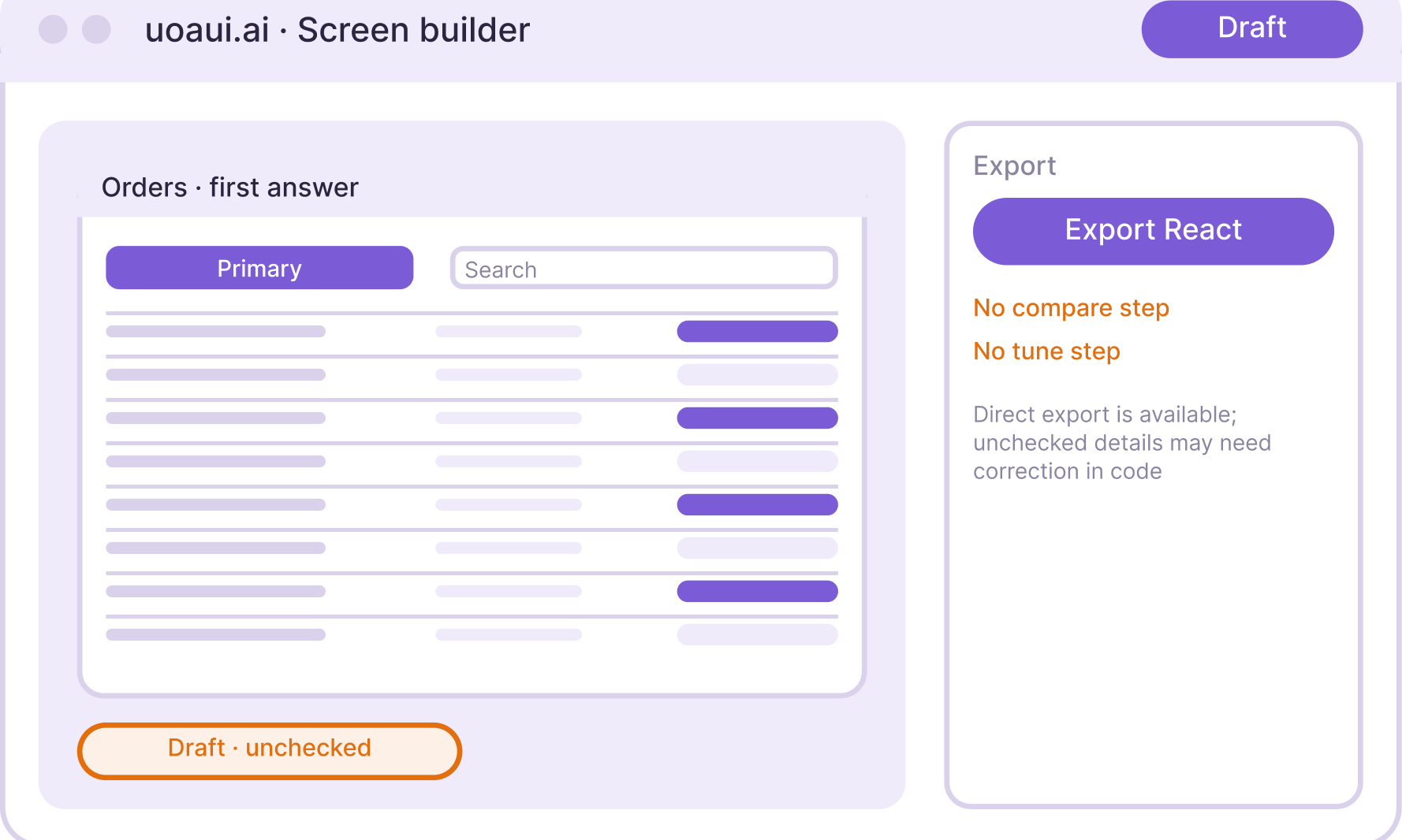
Accept the first draft
Accept the generated draft without reviewing its system differences.
Why I chose it
I give the designer ways to compare and tune the draft before handover. The current product leaves export available; the person decides when the screen is ready.
What it cost
Keeping export available preserves flexibility, but it also means the designer can export before reviewing. The interface does not enforce the review sequence.
What informed the decision
The export menu opens directly from the builder. React export generates the current canvas files without a compare or tune prerequisite. The only preview prerequisite in this panel applies to the Figma SVG format, which measures the rendered canvas.
The model drafts. The person decides.
Draft → compare → tune
I write the prompt. Claude drafts a screen, never the final answer. I compare and tune before exporting React a developer can inspect.
One structure, five systems
I designed the token, density and theme mapping. It resolves system-specific props across Salt, Material, Fluent, Carbon and my own system. Published React components are used where available; missing equivalents use explicit markup fallbacks, alongside a class-based in-house system.
Switch system, density or theme and the screen rebuilds: the layers below the model are mapped, not generated. This is my review workflow; the builder also allows direct export.
My brand, my system, my product
Brand and design system
I designed the name, brand, interface and system model. My own uoaui system sits alongside Salt, Material 3, Fluent 2 and Carbon; those four libraries retain their own authorship and component rules.
Original symbol and wordmark
One identity, several visual systems.
The name wraps around U and I. The product has its own identity, while the screen inside the builder follows the selected system. Brand, builder controls and the generated canvas have separate token layers.
Brand typography: Bricolage Grotesque · Inter · IBM Plex Mono. Component typography: Inter in my own system; system-native type in the others.
Midnight Canvas
Background #0A0E1A
Purple Compute
Primary accent #A78BFA
Peach Output
Secondary highlight #F0B5A4
Teal Input
Signal #3DDCC4
Current landing-page palette. The component library has separate light and dark semantic tokens.
Product identityName, logo, landing-page palette and editorial typography.
Builder controlsThe working environment around the canvas has its own tokens.
System mappingOne structure maps theme, density and components across five systems.
Component libraryMy uoaui system alongside the official Salt, Material 3, Fluent 2 and Carbon libraries.
The product layers I designed
Theme and density
Light and dark themes, with High, Medium, Low and Touch densities. The same component changes through tokens, rather than becoming a separate design.
Interaction styling
My system defines 150, 250 and 350ms motion, a shared radius scale and separate glass-opacity levels for light and dark surfaces.
The better the design file, the better the AI output. At Barclays I'm matching Figma naming to the code so there's no gap in either direction. When the model can't get the spacing right, I point it at the file. Everything after that, I'd rather iterate in code.
Built from the terminal
Both public rebuilds in this portfolio were made with Claude Code and Codex, in days, to test decisions with real-shaped data. Winking Star shipped the same way.
Where a designer still matters
A colleague brought me a screen made with AI. It looked fine, used none of our components, and nobody had tested it with a user. I rebuilt it in our own components and showed both. The existing components made it faster to build and kept it consistent with the platform. A generated screen still needs someone who watched how people work.
I have built a working builder, a comparison across five design systems and a component library. The current screens and walkthrough above show that work. This is private alpha, not a production adoption result.
What changed through exploration
I explored free-form generated UI and official React components. I chose a structured canvas mapped to system components, with explicit fallbacks, because a developer needs to inspect and recognise the output. My comparison and tuning practice keeps the model's first answer a draft.
The next validation question
Can another designer reach a useful, inspectable screen without me guiding them? That is the question for the alpha. No adoption rate, no time saving, no external test yet. When another designer gets there without me, I'll say so here.
Accessibility and responsiveness
System, theme and density stay inspectable.
The UI Kit has a skip link, and the system, theme and density controls work from the keyboard. That is what I can show today. It is not a full audit, and I haven't run one yet.
Across screen sizes
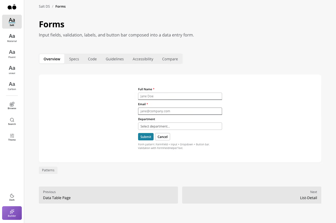
The Salt UI Kit fits 820px and 390px. The builder is a desktop canvas, and stays one.